
You might think having your own website is easy. You can simply hire website designers and website developers to do the job for you. But this is just one part of the picture. Not all designers and developers know the ins and outs of marketing.
Your website’s design is VERY important when it comes to increasing your business’ conversions, and ultimately, sales. You, and possibly a marketing manager, must be involved in the process. You must know the ins and outs of a website designed for conversion. Fortunately, we will be giving you the top website design essentials to optimize your website and achieve your conversion goals.
1. Limiting Options
We all want to think that we don’t have limitations. But this is not the case when it comes to website design. If you want to increase your conversion rate, you have to limit the choices of your customers. Having too much to offer increases your customers’ decision-making time.
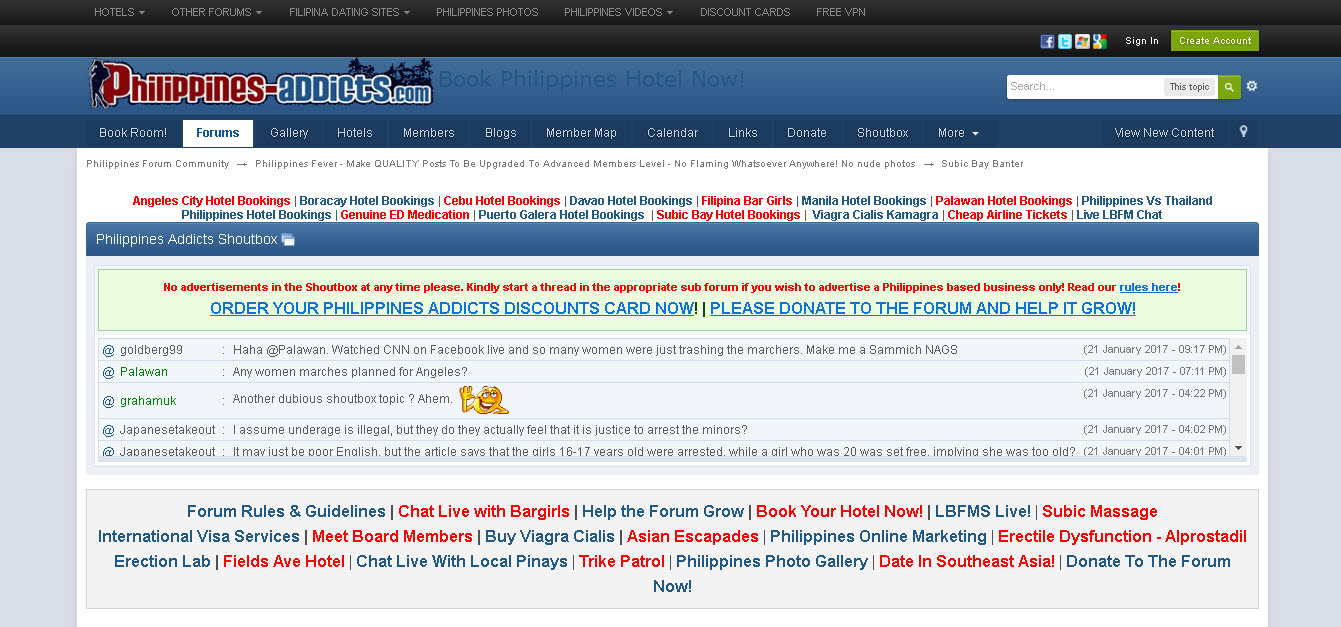
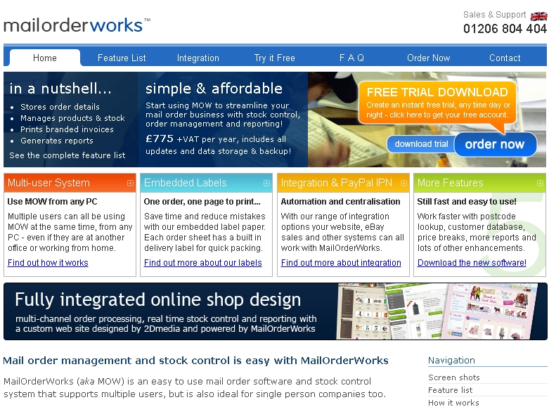
One example below is a website with too many choices for the viewer. This should be avoided.
Querubin, M. Limiting Options 1 [Image, Screen Capture]. Retrieved from this URL.
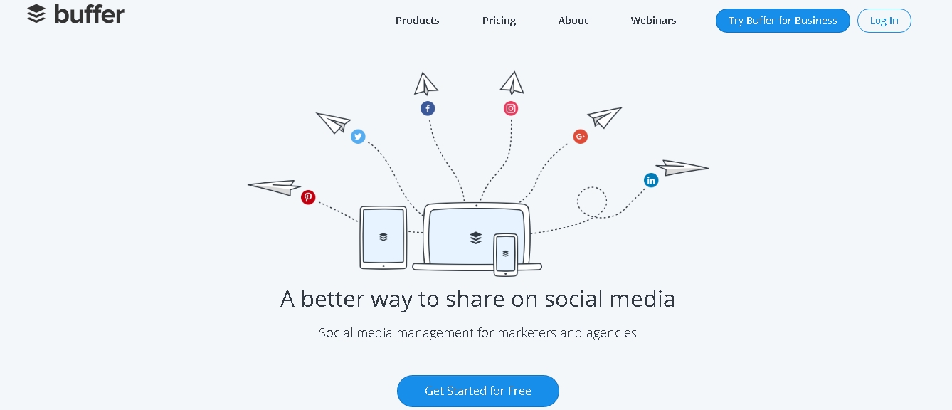
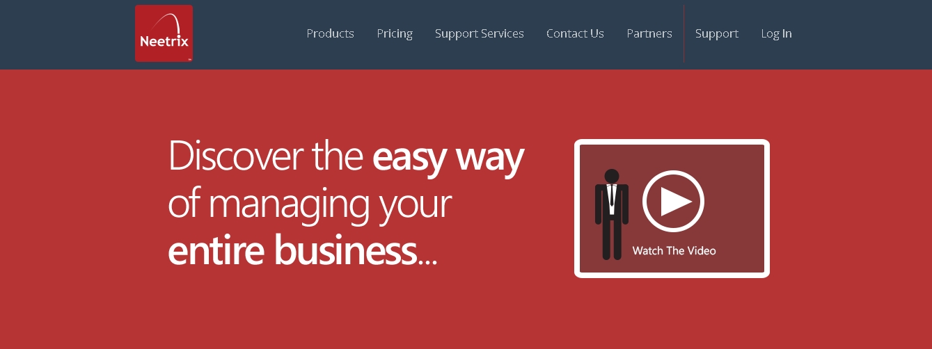
In contrast, below is Buffer’s website. It has a single call-to-action making it easy for the users to decide what to do.
Querubin, M. Limiting Options 2 [Image, Screen Capture]. Retrieved from this URL.
How To Apply It: First, minimize the number of links available in your homepage. It is best to create a full-screen homepage that limits the users to a single call-to-action. Your homepage’s ultimate goal should be summarized in a few clicks of a button. Let your viewers scroll down the page in order to view more about your company. Second, decide on your ultimate goal for a particular page. Think about what you really want them to do. You might want them to share a review, leave a comment, share your page on social media, or call your number. All of these should not be allowed in one single page. As said before, limit them to the best number of decisions they can make – that is the number ONE.
2. Emphasizing Your Buttons
Your call-to-action buttons can ultimately lead your users to conversion. They must always be emphasized within a page to catch the attention of your users. They must be bold enough to stand out.
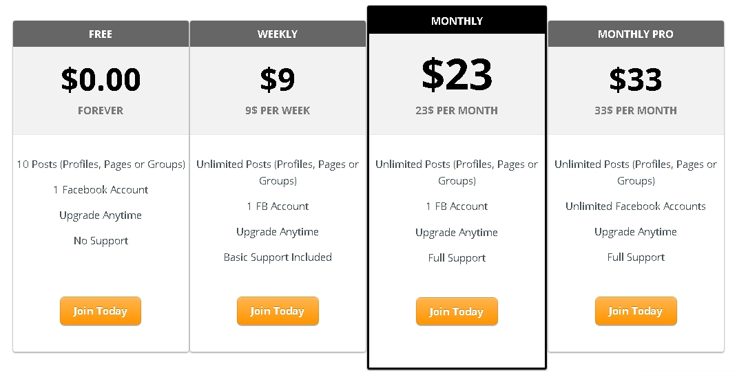
Check out the image below. Notice how the package placed in bold borders stands out from the other three packages.
Querubin, M. Emphasizing Buttons [Image, Screen Capture].
How To Apply It: Place your call-to-action buttons in thick, bold borders. Instruct your web designer to do this for every button you want to emphasize. You will be amazed at the difference.
3. Dividing Your Website Into Nine (9)
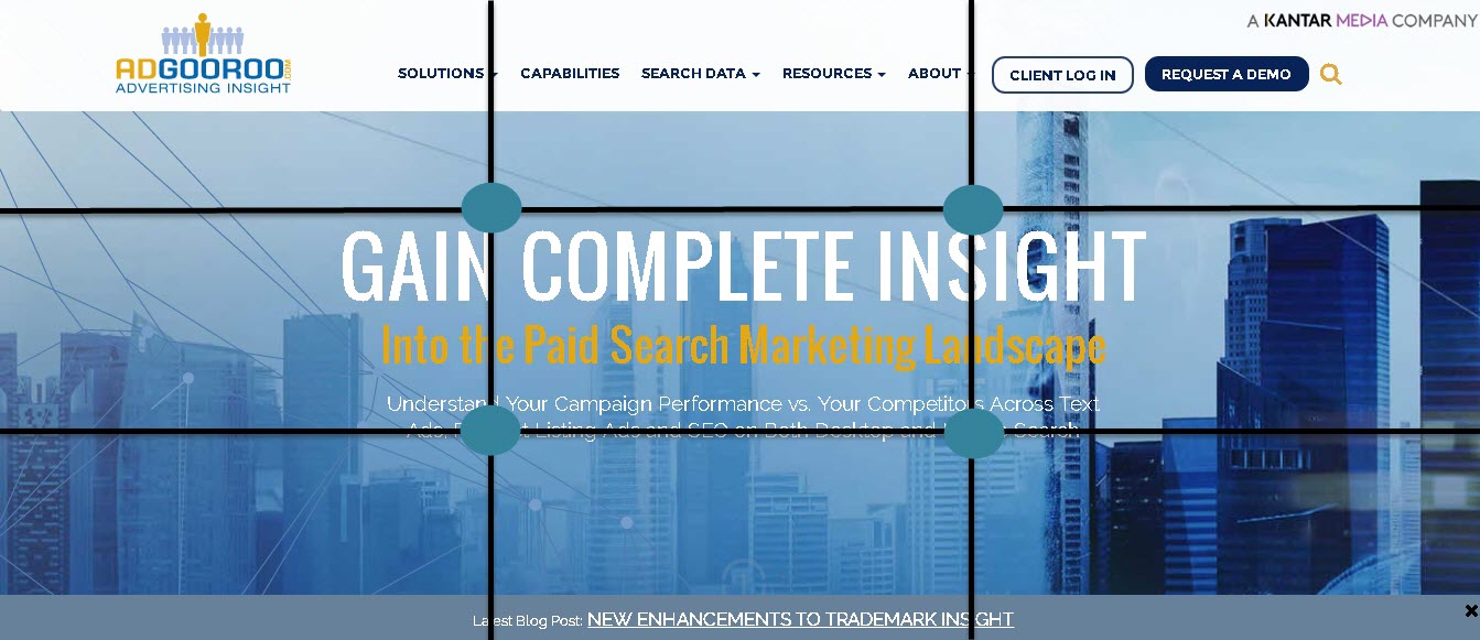
Focusing your user’s attention on a single part of the page can be a challenge. But you can do so with this simple tip. Try to divide your website into nine equal parts like in the picture below. Notice the four circles around the center of the page. These are the points most likely to catch the attention of users.
Querubin, M. Dividing Into Nine [Image, Screen Capture]. Retrieved from this URL.
One example will be AdGooroo’s website as seen in the picture above. Notice how the most important message is placed inside (and near) the four corners of these important points.
How To Apply It: Place your call-to-action and subliminal message s (text, images, and videos) in these four points of interest. Make sure the navigation bar is not located at these points to avoid providing the users with too much links to click.
4. Increasing Your Site’s Speed
People are very impatient. Even a user’s online attention spans for only eight (8) seconds. Thus, you must make sure your site loads as fast as possible or you might lose a customer to another company.
How To Apply It: Use these tools to check your site loading speed and fix any problems you might face:
If you are a non-technical person who wants to speed up your website, you can contact expert Ph.D. level developers like BuildaTeam.io here.
5. Maximizing Your Use Of Whitespace
Can you envision a website that is full of clutter? It will definitely burn out the user’s eyes and lead them to hit the back button. This is not what you want for your website. Maximizing your whitespace, the area without content, is a great way to increase your conversions.
You have to make sure that every element on your page is easy on the eyes. Whitespace is the solution for that.
Check out the difference between the two websites below. The one with more whitespace keeps your focus on the most important elements of the page.
Querubin, M. Whitespace 1 [Image, Screen Capture]. Retrieved from this URL.
Querubin, M. Whitespace 2 [Image, Screen Capture]. Retrieved from this URL.
How To Apply It: Talk to your website designer about putting spaces in between elements. Make sure the most important points in your page are given focus. Ensure that texts are readable by giving ample space between letters and between paragraphs. Plus, make sure that there isn’t too much going on inside a single page of your website.
6. Using High-Quality Images and Videos
You must always provide high-quality images and videos for your users. A crappy, low-resolution image won’t do. Think about how your customers will perceive your business. High-resolution images give a professional feel towards your website. Believe me, this is what you would want to project to your customers.
How To Apply It: If you can professionally create images, then you can do this yourself. However, you can hire website designers and graphic designers to do the job for you. If you are low on budget you can search for high-resolution images from Creative Commons. This is a site that provides images that are free to use commercially.
7. Using Shorter Forms
Are you like most people who hate too much work? Then, Bingo! People hate it when they have to type in too much information to get what they want. Experts always tell us to respect people’s time. Thus, shorter forms are better as opposed to longer ones.
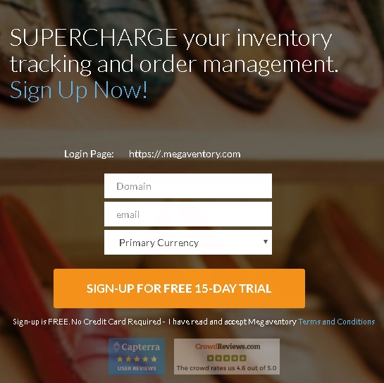
Check out the form below. Notice that Megaventory only asks three (3) information from its users. This is a good principle to follow.
Querubin, M. Short Forms [Image, Screen Capture]. Retrieved from this URL.
How To Apply It: Keep your forms shorter by asking for essential information only. Avoid asking unnecessary details which opts your user to back out of the website.
8. Making Your Site Responsive
A responsive website is one that can be viewed and can adapt or respond to all devices including smartphones, tablets, desktops, and laptops. As you can see, more and more people are searching online through their mobile devices. If your site is not responsive, you are missing out on all the action. You can lose would-be customers to other businesses. The importance of a responsive web design is even recognized by Google. It has released an algorithm called Mobilegeddon which favors responsive websites in search engine results.
How To Apply It: Contact your website designer and developer regarding the change. Ask them to create a responsive design for your website. Make sure the theme of the desktop and mobile versions are similar as different ones can confuse your viewers.
9. Providing Amazing Content
Mediocre content just won’t do every single time. Great content is necessary to attract your customers and lead them to conversions. Plus, great content shows that you are trustworthy in the business. If you are a service provider, it shows that you are an expert in your field.
How To Apply It: Always serve what your audience want and need. Invest the time and effort into creating great, unique content that will capture your user’s interest. You don’t have to be sales-y all the time. You don’t have to stick your products and services in your customer’s faces. Most of the time, you have to provide value by posting content that might help users in their problems.
10. Providing Proof And Building Trust
People like the persons who they trust and know about. Thus it is best to instill trust and reputation when it comes to building your websites. According to Warren Buffet, “It takes 20 years to build a reputation and five minutes to ruin it.” This is true when it comes to business. A lack of social proof regarding your products and services can work against you.
How To Fix It: Provide testimonials, press appearances, and social media shares on your website. You can even provide quotes stated by famous people. You can create a page fully dedicated to testimonials within your website. Don’t stop on written statements alone. You can even provide video testimonials from previous clients.
11. Using Subliminal Messages
Think about the theme of your website. What do you want to convey? Using subliminal messages such as images that evoke the feeling you want to instill can increase your conversions. Shopping malls play Christmas songs during the Holidays just to evoke the feelings related to this event. In this way, they are more enticed to buy for themselves and their loved ones.
How To Apply It: Consider the feelings you want to evoke in your users. Do you want women to purchase shoes from you? Then put a picture of a lady wearing stunning shoes. Invoke the satisfaction women get when they have a good pair of shoes. You get the picture right?
12. Guiding Your Viewers’ Focus
We read traffic signs to guide us through the road helping us get from Point A to Point B. You should be doing this to your viewers as well. Directions point your viewers to where you need them to be. This will help you increase conversions and ultimately, sales.
Below is an example of website which use directional cues to guide their viewers to buy their product.
Querubin, M. Focus [Image, Screen Capture]. Retrieved from this URL.
How To Apply It: Ask your website designer to design a website with arrows or directional cues pointing to your call-to-action. Make sure you emphasize directional cues and call-to-action buttons in order to maximize this tip.
13. Avoiding Poor Navigation
A user goes to a website to get what he wants or needs. He/ she want this to be as quick as a jet. Thus, it is necessary for you to make sure your navigation is convenient for your customers. The navigation of your site must be simple-to-use and it must have a great hierarchical structure. Your navigation bar allows your users to contact you and to browse through more information. If you can’ provide this to your viewers then you simply have to fix your site structure fast.
How To Apply It: Brainstorm through your objectives. What do you want your users to do when they go through the site? Make a list of the products and services you have to offer and create a hierarchical structure for the pages. Make sure the navigation bar is simple and contains the information the users need to convert.
In Conclusion:
Having your own website is only one side of the coin. Ensuring that it converts your viewers into customers is another.
If you want a website optimized for conversions, contact us for a free quote at hello@buildateam.io
<!– Read also: Increase Your Website’s Conversion Rate: 25 Effective Ways to Do It –>


